Creating Balance In Your Display Cases
Larry Johnson
The changing landscape of the jewelry industry in the last few years has prompted a transformation in the display and packaging of merchandise.
Over the last few years, it seems the number of display case setups and point-of-purchase material provided by suppliers has grown at an amazing rate. The goal is twofold. They help draw the consumer’s attention to a specific product, while at the same time, creating confidence in the brand.
Unfortunately, the resulting showcase landscape may become somewhat confusing for the consumer, who may feel overwhelmed or bombarded by various messages. The challenge for the retailer is to display his own house brand or generic goods as appealing and professionally as the vendor-branded jewelry and to avoid presenting them as inferior or ‘less than.’
It is fair to say that the recent popularity of shop-in-shop fixtures have helped differentiate the branded goods from the store brand by their sheer physical presence. Large displays in a custom fixture are very impressive and speak loudly. In fact, the very name shop-in-shop implies a physical separation that is easier for the customer to see and understand. Conversely, when the branded goods are on a small display inside a case with store goods, the challenges to communicate a difference are much greater.

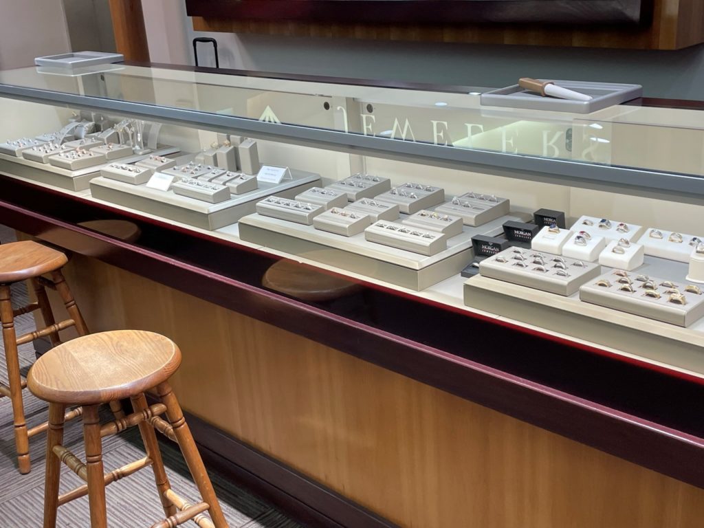
Good vignette arrangement
Setting the Stage
Since the margins are usually greater on house brands, retailers would likely prefer to sell their own items. To capture these extra profit dollars, however, savvy retailers understand their own merchandise must be displayed in a manner that rivals the branded displays to compete effectively. Cheap leatherette displays from 1992 simply will not do the job.

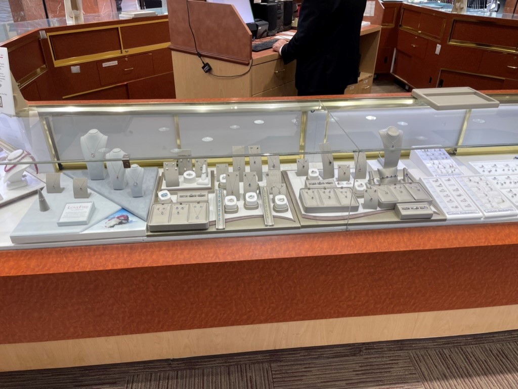
Bad example showing disorganization and confusionin the case causing the customer to walk away.
Too many colors and textures all butted together.I call this the “Show up and throw up” display strategy.
One option is to incorporate vignette and other more linear showcase displays to help the jeweler create its own ‘branded’ look. Featuring more fashion-forward designs, special colors, and less common, more luxurious materials, a vignette is a display designed to occupy only a portion of a showcase and is designed to attract attention.
Typically, about 16”- 22” wide, vignettes usually sit on a platform to provide a ‘stage’ for display elements and naturally, the merchandise. To set the product apart in the mind of the consumer, the vignette is usually given an empty space of about 2-3” on either side, which is referred to by experts as negative space.
Make your display vignettes attractive and full, without overcrowding. Remember, you are displaying your brand here, so density should be about the same or slightly heavier than the displays of other brands you carry. As with all good displays, place the top 20 per cent of merchandise, by price point, you are showing on less dense trays and preferably individual elements to set it apart. Putting your best ring in a tray with 23 other lesser rings is a sure way to diminish its impact. If it is a special piece, treat it so.
If your store-branded merchandise of a particular category is too numerous to fit on a single vignette, consider using several and separate each with negative space. Remember to sort the merchandise into a logical category within each vignette.
The common alternative to a vignette is a full linear showcase display, which is designed to fit fully from side to side in a showcase and occupy the entire case. These typically use a flowing riser platform that gives the case continuity and communicates the
impression of a broad selection. If your merchandise counts are too numerous to fit on vignettes, consider linear displays of a single color and organize to position your brand as an equal to your vendors’. Situate your better pieces in the center on less dense display elements and feature best what you want to sell the most.
In essence, if you study the composition of branded displays you see in all types of shops and think about what appeals to your eye, you will be able to bring those features to your own case. The principles of attracting attention and creating interest apply regardless of merchandise type.
Message Sent.
Regardless of your display choice, good in-store signage is critical. Do not assume anything. Use quality, well-made signs that communicate the major information conveyed to customers in your sales presentation. Examples might be metal types, marketing names, stone types, country of origin information, warranties, exclusivity, or other possible points of interest for the customer. If clients read something inside a case that you also emphasize in your presentation, this can help them absorb your message and improve the chances of making a sale. Communication is a good thing, especially when it comes to your store name, which should be placed in each showcase and certainly on platforms displaying your house brand. Ensure your store name signs are as nice as those provided by your vendors.
The combination of vendor and store brand displays in a single environment can make a nice store look like a patchwork quilt, overwhelming consumers with multiple messages and a myriad of brand merchandise choices. With a little forethought and planning, a retailer can help create balance. The payoff can be greater sales across the board and satisfied customers likely to return.

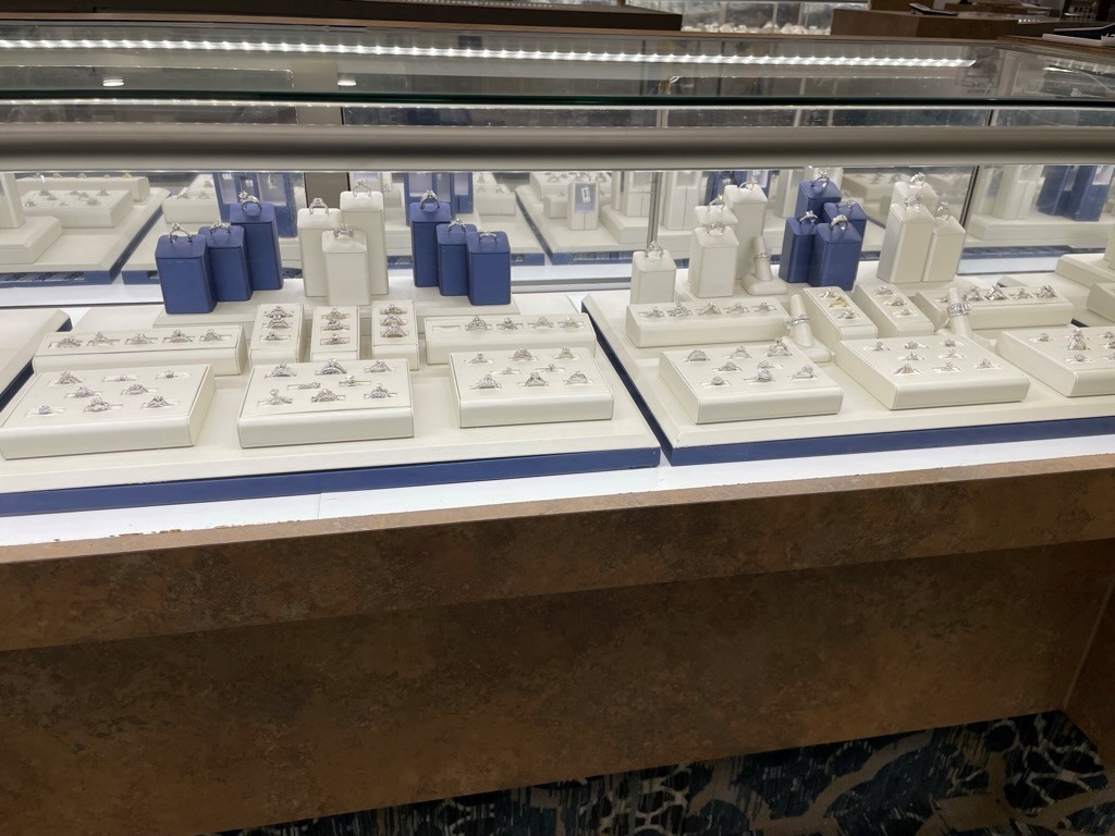
2 tone display where the secondary color (blue) is used in the base of the vignette platform AND on the few display elements to highlight the highest ticket items (the ones the store wants MOST to sell) in the showcase.


