ON TREND
September 2024
Sign Design Guidelines: Creating Signs Your Customers Wil Read
Lyn M. Falk
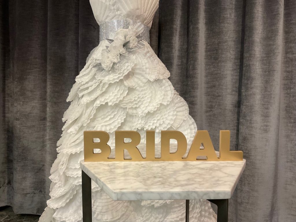
3-D sign which could sit on top of a showcase. Photo by Retailworks, Inc.
Sign pollution – unfortunately, it’s alive and well in retail environments today. Too many signs are one of the main reasons customers don’t read signs. Especially if they are poorly designed, or in too many colors, shapes, and sizes, and have too many words. Customers’ brains will simply bypass reading these signs because it takes too much time and energy to make sense of them.
Creating sign design guidelines will make your life with signage easier. They organize your signs via a set of coordinated design elements so all staff will be on the same page when creating and posting a sign. And the brain will be able to see and quickly absorb the meaning of the signs, resulting in customers actually reading them.
How do you create a set of sign design guidelines?
First categorize all the signs you have in your store, ie:
a. logo
b. department
c. product information
d. vendor
e. promotional
f. sale
g. services offered
h. store policies
i. digital info: website, social media icons, hashtags
The second step is to create ‘design criteria’ for each category of signs:
– overall size
– font type and size
– max number of words
– color(s)
– graphic(s)
– material, ie: printing on paper, cardstock or sturdier substrate;
– frame and/or sign holder
When you consistently use a coordinated set of design elements, you train your customer to look for the “promotion” sign, and when they want information about a product, they look for your “product info” signs.
Some sign design tips:
– Less is more.
– Incorporate symbols, photos, and graphic images to communicate messages without using a lot of words.
– Don’t handwrite your signs unless you or someone on your staff has exceptional penmanship. Poor handwriting decreases the value of your brand.
– Don’t scotch tape signs to anything. Ever. Again, this cheapens the image of your brand. Instead, use frames or acrylic sign holders for a more professional look.

